
The <table> element in HTML empowers web creators to present tabular information, including text, images, links, and additional tables, in a structured format characterized by rows and columns of cells.
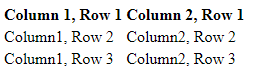
Simple Table Format:
<table> <tr> <th>Column 1, Row 1</th> <th>Column 2, Row 1</th> </tr> <tr> <td> Column1, Row 2</td> <td> Column2, Row 2</td> </tr> <tr> <td> Column1, Row 3</td> <td> Column2, Row 3</td> </tr> </table>
The code snippet will generate a <table> comprising three rows in total (<tr>): one row containing header cells (<th>), and two rows containing content cells (<td>). <th> elements serve as tabular headers, while <td> elements represent tabular data. You have the flexibility to include any desired content within <td> or <th> elements.
Example table layout:
Spanning:
You can extend the span of table cells across multiple columns or rows by utilizing the colspan and rowspan attributes, which can be applied to both <th> and <td> elements.
table> <tr> <th>Column 1, Row 1</th> <th>Column 2, Row 1</th> </tr> <tr> <td colspan="2"> Column1, Row 2</td> <td> Column2, Row 2</td> </tr> <tr> <td rowspan="2"> Column 1, Row 3 - Spanned Across Two Rows</td> <td> Column2, Row 3</td> </tr> <tr> <td>column 1, Row 4</td> <td>column 2, Row 4</td> </tr> </table>
Output:
| Column 1, Row 1 | Column 2, Row 1 | |
| Column 1, Row 2 | Column 2, Row 2 | |
| Column 1, Row 3 – Spanned Across Two Rows | Column 2, Row 3 | |
| Column 1, Row 4 | Column 2, Row 4 | |
Note: It’s important to avoid designing tables where rows and columns overlap, as this violates HTML standards and may produce inconsistent rendering across different web browsers.
Explanation of attributes:
- rowspan: Specifies the number of rows spanned by a cell. Default is 1, and 0 means it spans to the last row of the table section (<thead>, <tbody>, or <tfoot>).
- colspan: Specifies the number of columns spanned by the current cell. Default is 1, and 0 means it extends to the last column of the <colgroup> in which the cell is defined.
Column Groups:
At times, you might find it necessary to style a column or a group of columns, or to logically group columns for semantic clarity. For such purposes, HTML provides the <colgroup> and <col> elements.
The <colgroup> tag, which is optional, enables you to group columns together. It should be nested within a <table> element, positioned after any <caption> elements, and before any table content (e.g., <tr>, <thead>, <tbody>, etc.).
Example usage of <colgroup>:
<table> <colgroup span="3"></colgroup> <colgroup span="2"></colgroup> </table>
On the other hand, the <col> tag is optional and allows you to target individual columns or a range of columns without applying logical grouping. If used, <col> elements must be placed within a <colgroup> element.
Example usage of <col>:
<table> <colgroup> <col id="id1" /> <col /> </colgroup> <colgroup> <col class="class 1" /> <col class="class 2" span="2" /> </colgroup> <!-- More colgroup elements with col elements can be added here --> </table>
CSS styles such as border, background, width, visibility, and display (including display: none) can be applied to both <colgroup> and <col> elements. Utilizing display: none will effectively remove the specified columns from display, causing the table to render as if those cells do not exist.
Table with head, body, foot and caption
HTML offers additional elements such as <thead>, <tbody>, <tfoot>, and <caption> to enhance the semantic structure of tables and facilitate separate CSS styling. These elements play a crucial role in organizing and styling tabular data effectively.
When printing a table that spans multiple pages, most browsers repeat the contents of <thead> on each page, ensuring clarity and continuity.
It’s essential to follow a specific order while structuring tables with these elements. However, not every element behaves intuitively within this structure. The following example illustrates the correct placement of these elements:
<table> <caption>Title Of The Table</caption> <thead> <tr> <th>Header 1</th> <th>Header 2</th> </tr> </thead> <tbody> <tr> <td>Body Text 1</td> <td>Body Text 2</td> </tr> </tbody> <tfoot> <tr> <td>Footer Text 1</td> <td>Footer Text 2</td> </tr> </tfoot> </table>
The example below demonstrates two renditions of the table: one without any styling and the other with CSS properties applied for illustration purposes. These styles include background-color, color, and border. While these styles are provided as a visual aid, they are not integral to understanding the table structure.
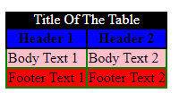
Styling details:
- <caption>: White text on a black background.
- <thead>: Bold text on a blue background.
- <tbody>: Text on a pink background.
- <tfoot>: Text on a red background.
- <th>: Black borders.
- <td>: Green borders.
Heading Scope
The <th> elements are commonly used to designate headings for table rows and columns, enhancing table readability. Here’s an example:
<table> <thead> <tr> <td></td> <th>Column 1</th> <th>Column 2</th> </tr> </thead> <tbody> <tr> <th>Row 1</th> <td></td> <td></td> </tr> <tr> <th>Row 2</th> <td></td> <td></td> </tr> </tbody> </table>
To enhance accessibility, you can utilize the scope attribute. Here’s the improved version with the scope attribute:
<table> <thead> <tr> <td></td> <th scope="col">Column 1</th> <th scope="col">Column 2</th> </tr> </thead> <tbody> <tr> <th scope="row">Row 1</th> <td></td> <td></td> </tr> <tr> <th scope="row">RoW 2</th> <td></td> <td></td> </tr> </tbody> </table>
The scope attribute is an enumerated attribute, meaning it can have a value from a specific set. This set includes:
- col
- row
- colgroup
- rowgroup